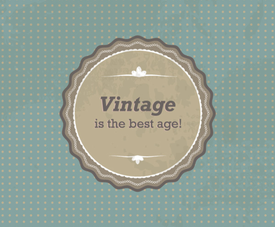
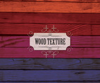
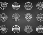
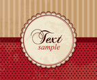
Why go vintage? Well, why not? This graphic uses a vintage style to keep your viewers interested and to draw attention to your message. The badge on the center of the page looks worn and frayed thanks to a clever use of shading. The circle in the center of the image resembles leather, and it complements the text by creating a clear focal point. The background consists of symmetrical dots. There are also several smart framing devices, including three patterns that extend around the circle. This is a hip choice that uses classic textures in a smart and engaging way.


Copy this link (right-click + 'copy') on your web

200,000+ Vectors
from $9.99 / month
Any questions? Visit the FAQ
200,000+ Vectors
from $9.99 / month
Any questions? Visit the FAQ